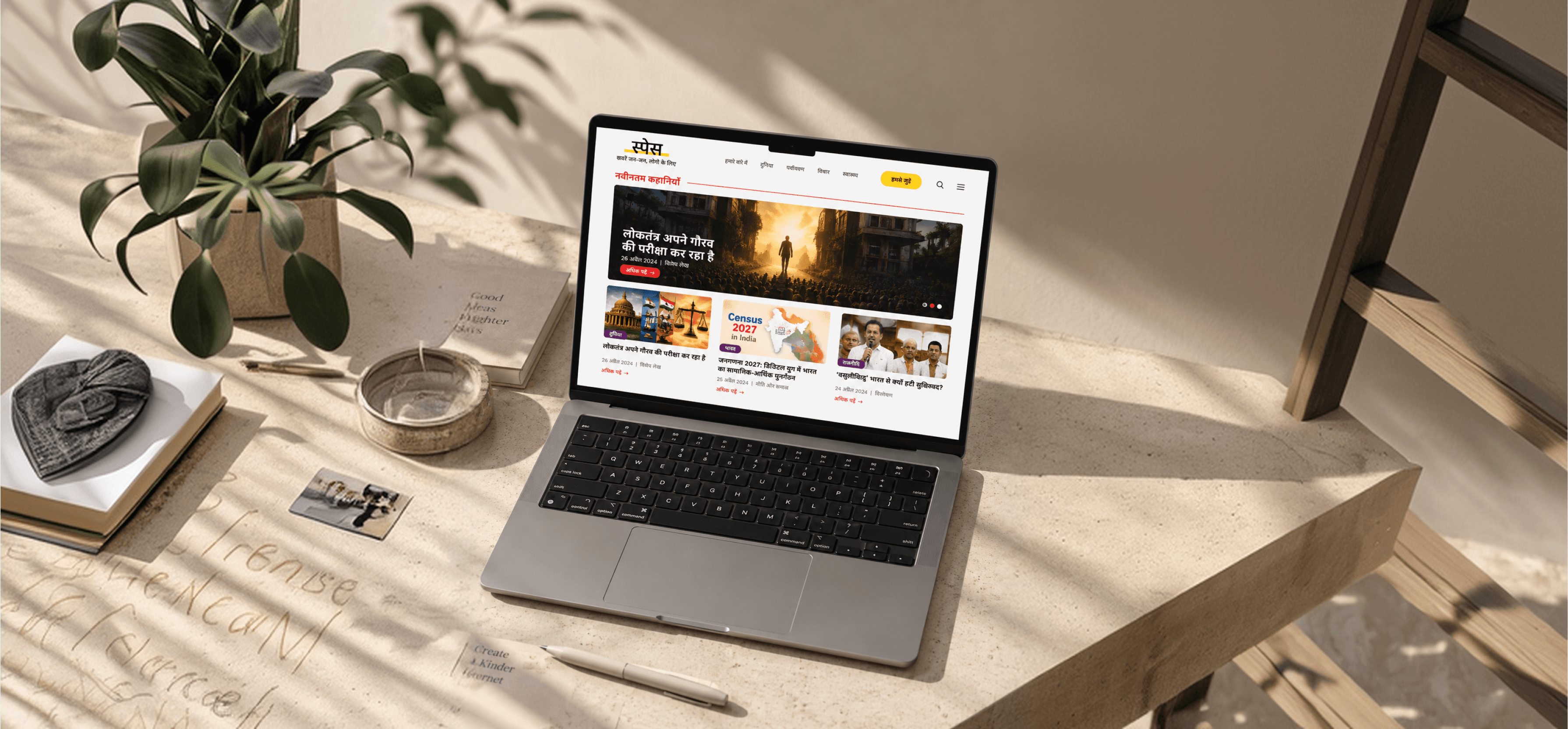
Thanks for Reading

Phool Bazar ( Shop owner/vendors)

Suzuki Access 125 BSE Dashboard
SPS Media
Role
UX/UI Designer
Project
Website Redesign
Organization
SPS Media
Duration
45 Days
Team
Individual
Redesigning a digital news experience for clearer content discovery and readability.
OVERVIEW
TASK
PROCESS
RESEARCH
DESIGN DIRECTION
UI DESIGN
FEEDBACK & REFINEMENTS
FINAL DESIGN
CHALLENGES
REFELECTION


Figure 1.1
Figure 2.2
Down To Earth
The Wire
Figure 4.3.1 — Initial SPS Media website design before client feedback.
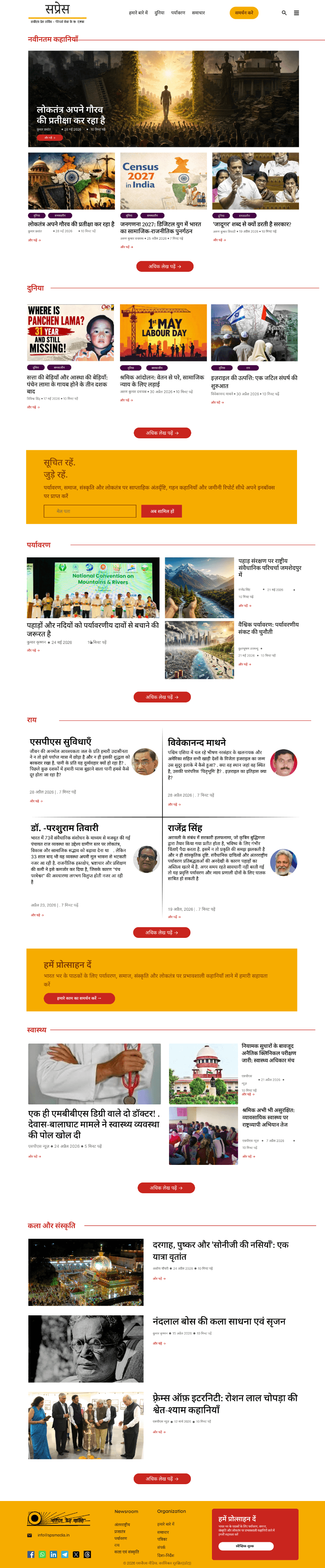
Figure 4.5.1 — Full homepage
Figure 4.5.1 — Article page
Figure 4.5.2 — Header and navigation.
Figure 4.5.2 — Dropdown
Figure 4.5.2 — Landing Page
Figure 4.5.2 — More section
Figure 6.1 — Before
Figure 6.2 — After
Figure 6.2 — Before
(Random post articles without categories)
Figure 6.2 — After
(Post Articles without categories)
The Print
Overview
SPS Media is a Hindi-language media platform that publishes news, features, and stories across different topics. The project involved redesigning its website to create a clearer and more organized digital experience for readers.
I worked on redesigning the website from scratch, focusing on the presentation of content across the homepage and article experience.
The redesign explored how layout, navigation, visual hierarchy, and content organization could help readers browse stories and move through the website more easily.
Live website: SPS Media

Task
The task was to design a website experience for SPS Media that presents its editorial content in a structured and engaging way.
My responsibility was to work on the UI/UX design in Figma, using the editorial references provided to me and feedback from users and the client to guide the design.
Project focus
Explore editorial website references.
Design the website interface in Figma.
Organise editorial content into a clear visual structure.
Refine the design based on user and client feedback.
Contribute to the design of a website that is now live.
Process
4.1 Research
4.2 Design Direction
4.3 UI Design
4.4 Feedback & Refinement
4.5 Final Design
Before & After Comparison
I approached the project through reference exploration, interface design, and feedback-based refinement. The process helped me understand the visual conventions of editorial websites and apply them to the SPS Media experience.
Exploring Editorial References
To understand how editorial websites present a large amount of content, I explored examples shared with me during the internship.
These references helped me examine different approaches to displaying articles, organising content, and creating a visual hierarchy across an editorial homepage.
Defining the Visual Direction
After exploring the references, I used the learnings to guide the visual direction of the SPS Media website.
The design focused on presenting editorial stories through prominent imagery, clear headlines, and organised content sections.
Initial Design
The first website design focused on presenting SPS Media’s news content through a structured layout, with clear sections for different news categories and featured stories.
I explored the placement of headlines, images, navigation, and content cards to create a browsing experience where readers could discover and access news articles.
Design Refinement Based on Client Requirements
After reviewing the initial design, the client requested changes to better align the website with their preferred visual direction and content presentation.
The Redesigned Website applying the Client Feedback
Based on the client’s feedback, I refined the website’s visual presentation to align more closely with the requested editorial style.
The redesigned SPS Media website is now live. The interface presents editorial content through a structured homepage with featured stories, latest posts, and category-based sections.
The design brings together the visual direction developed in Figma and the content requirements of the organisation.
Before and After
The comparison below shows the original SPS Media homepage alongside the redesigned interface.
The original design provides the baseline for understanding the project, while the redesigned version shows the interface I created in Figma.
What I explored
How editorial websites organise and display stories.
How images and headlines work together to attract attention.
How different content sections are separated and prioritised.
How navigation and categories help users explore articles.
Design considerations
Content hierarchy: Make headlines and featured stories easy to notice.
Visual structure: Separate different types of content into recognisable sections.
Editorial presentation: Use imagery and typography to support the reading experience.
Navigation: Provide visible ways to explore different content categories.
Consistency: Maintain a coherent visual language across the website.
The key feedback was:
Introduce yellow elements: Incorporate yellow accents into the interface as requested by the client.
Keep the design simple and editorial: Maintain a clean, content-focused layout that supports reading and news discovery.
Make buttons red: Use red for buttons to make the primary actions more noticeable.
Refine the visual presentation: Adjust the design according to the client’s requirements while retaining the website’s editorial purpose.
The revised direction focused on:
Introducing the requested yellow visual elements.
Keeping the layout simple and focused on news content.
Using red buttons to make key actions stand out.
Maintaining a clear content hierarchy across the homepage and article pages.
Design considerations
Content hierarchy: Make headlines and featured stories easy to notice.
Visual structure: Separate different types of content into recognisable sections.
Editorial presentation: Use imagery and typography to support the reading experience.
Navigation: Provide visible ways to explore different content categories.
Consistency: Maintain a coherent visual language across the website.
References explored
Reflections
What I learned
Final Takeaway
Working on the SPS Media website redesign helped me understand how to translate client requirements into a practical digital experience.
Designing for a real organisation: I learned to consider the organisation’s needs and expectations while making design decisions.
Balancing visual direction: I gained experience incorporating requested colours and visual elements while maintaining a simple editorial style.
Learning from references: Reviewing editorial websites such as Satya, Down To Earth, The Print, and The Wire helped me explore different approaches to presenting news content.
Using feedback to refine a design: Feedback from the client and users helped me understand the importance of reviewing and improving a design rather than treating the first version as final.
Working independently: Completing the UI/UX design as the sole team member gave me experience managing the design work independently, from exploring the visual direction to refining the interface.
This project taught me that website redesign is not only about creating a visually appealing interface. It also involves understanding the organisation’s requirements, presenting information clearly, and refining the experience through feedback.
Seeing the website go live made the project especially meaningful because I could see my UI/UX design work being implemented in a real-world context.




Challenges
Balancing Client Feedback with the Editorial Visual Style
One of the main challenges was incorporating the client’s feedback while maintaining a simple, clean, and editorial appearance for the website.
The client wanted blue in there website then chnages to yellow elements to be included in the design.
Buttons needed to be red and visually noticeable so users could easily identify important actions.
The challenge was to introduce these colours without making the interface feel visually crowded or distracting from the news content.
I had to consider how the colours, typography, spacing, and content layout could work together to maintain an editorial feel.
Organising News Content Clearly
The website needed to present different types of news and editorial content in a structured way.
I needed to consider how headlines, images, categories, and supporting information would appear together.
The layout needed to make the content easy to scan while keeping the visual presentation simple.
I explored the provided editorial website references to understand different ways of organising and presenting news content.
Refining the Design Through Feedback
Another challenge was making sure the design addressed the client’s expectations and users’ needs.
I gathered feedback from the client and users during the design process.
Their feedback helped me identify areas that needed further attention.
I used this feedback to refine the interface and align the design more closely with the project requirements.